Quiz Checkout
The Quiz Checkout is a wonderful tool to highlight important changes in the revision. However, the users never see if the answers where actually correct. Especially if only a certain percentage needs to be correct.
-
I suggest:
After the quiz checkout, the user is presented with the result of his answers (maybe in a pop-up window). Questions answered correctly will be highlighted in green and questions answered incorrectly will be highlighted in red.
Depending on the settings, the user has to try again or is able to proceed, even with not all questions answered correctly.
-
What is it good for?
The user should be informed about incorrectly answered questions. Especially with the following example:
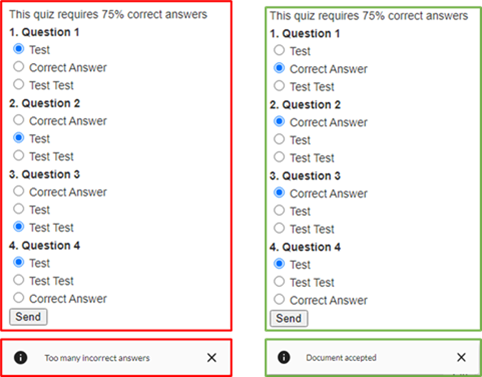
The quiz checkout requiring 75% correct answers and there is 4 Questions. The user can answer one question incorrectly and will never know that it was incorrect, because he passed without any information. See picture.
0
Comments
Hello Matthias Loesch,
Thank you for your feedback.
It is intended to not show the result to users. The reason for this is that if we give the users the answers, chances are that they will not re-read the changed content and just guess their way to 100% quiz result.
Of course, we can reevaluate this if we see that many other users would like this feature to be changed!
Please sign in to leave a comment.